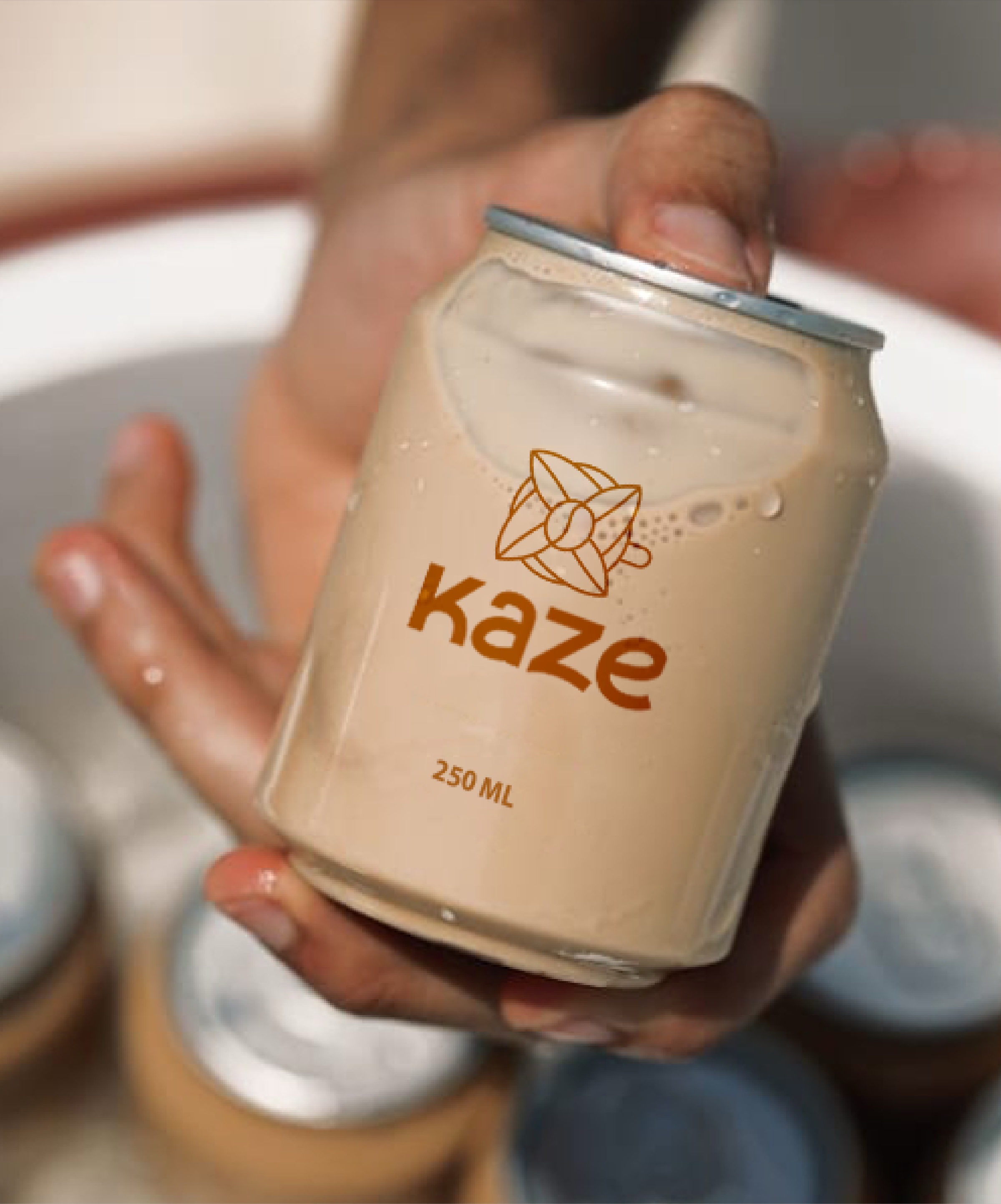
KAZE CAFE
Kaze began with a simple love for coffee. What started as curiosity slowly turned into a quiet obsession-searching for the perfect cup. Born in Kuwait, their menu reflects years of exploration, shaped by places, people, and moments gathered along the way.
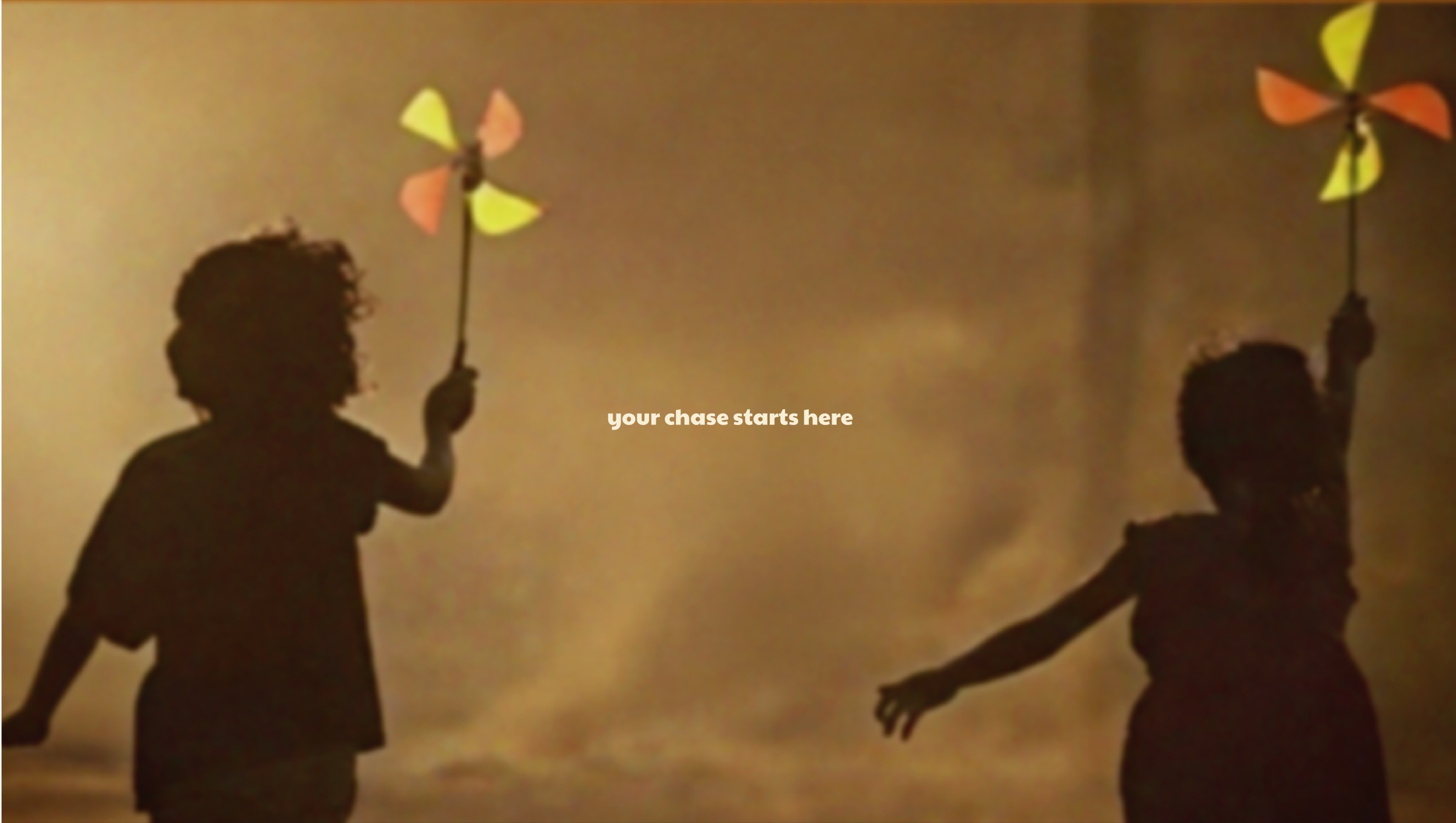
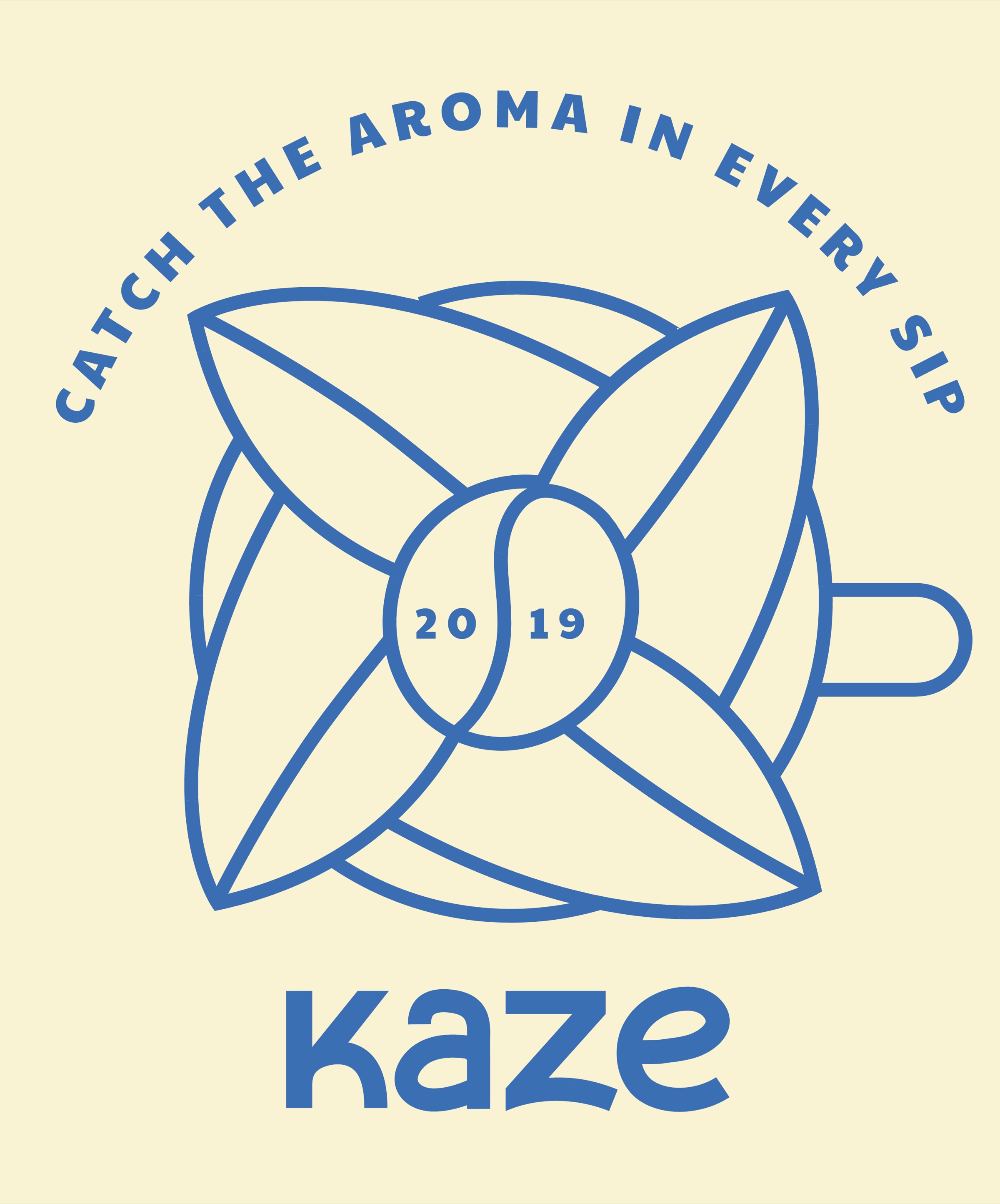
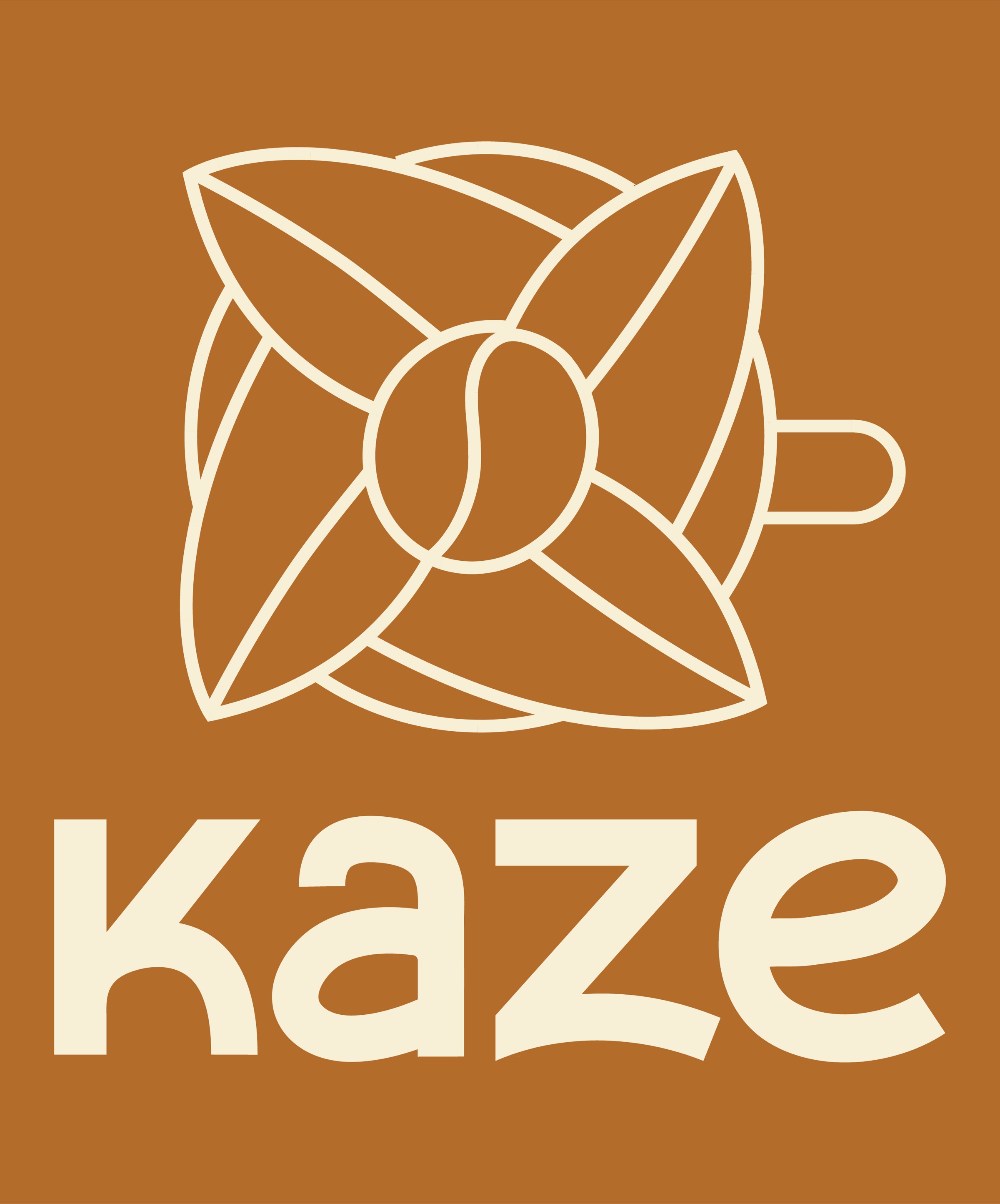
The founders started their coffee journey back in 2019 under the brand Kamikaze cafe. As they grew, so did their vision that led them to evolve into Kaze-Japanese for wind. Invisible, yet deeply felt. Just like the experience they set out to create.
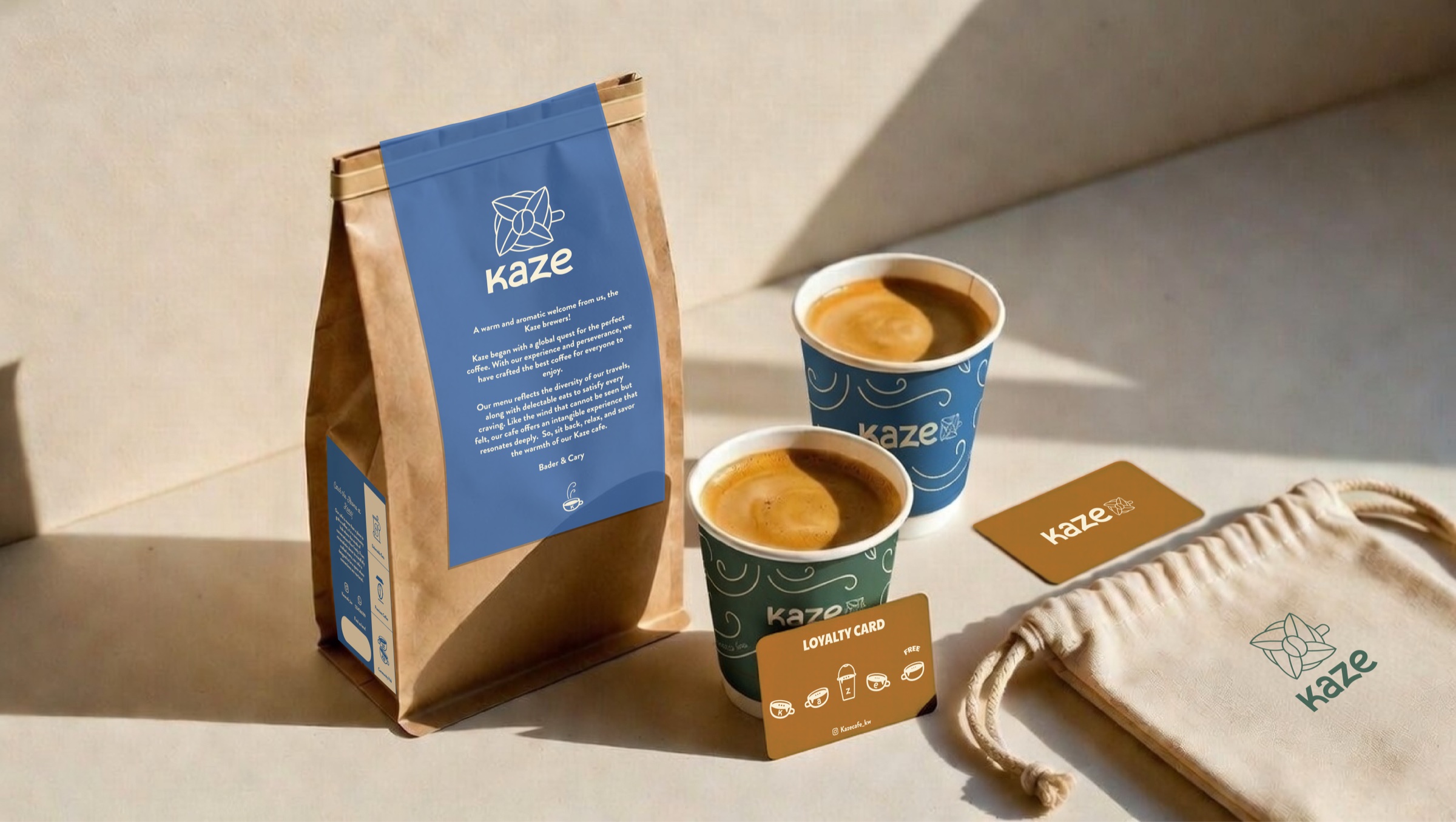
A spinning pinwheel became our inspiration-simple, familiar, like wind, like conversation, like coffee shared between people. The symbol brings together four overlapping leaves, interwoven around a coffee bean-a key client mandate. In motion, it feels almost like it’s being gently stirred, capturing the quiet ritual of coffee and the sense of movement that defines Kaze.
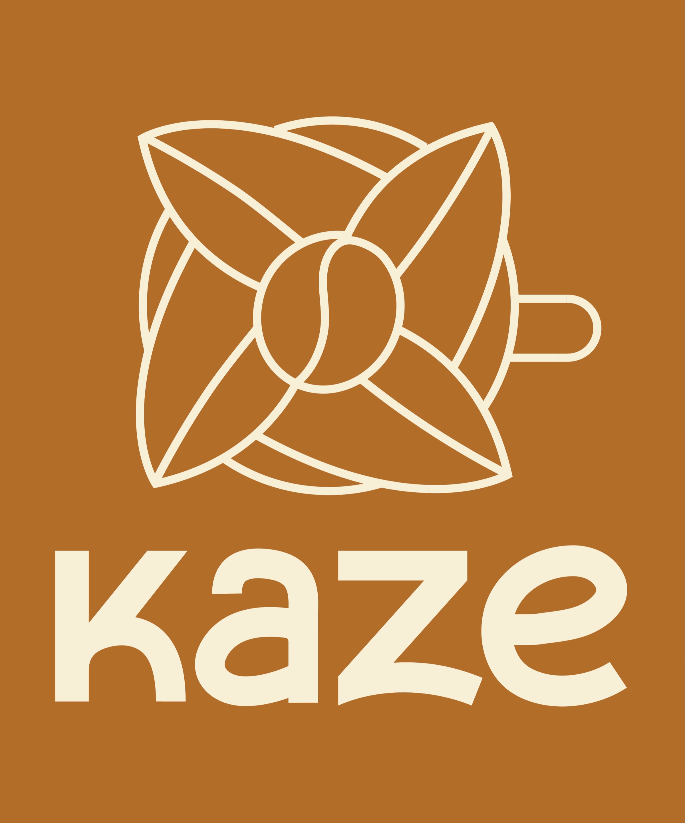
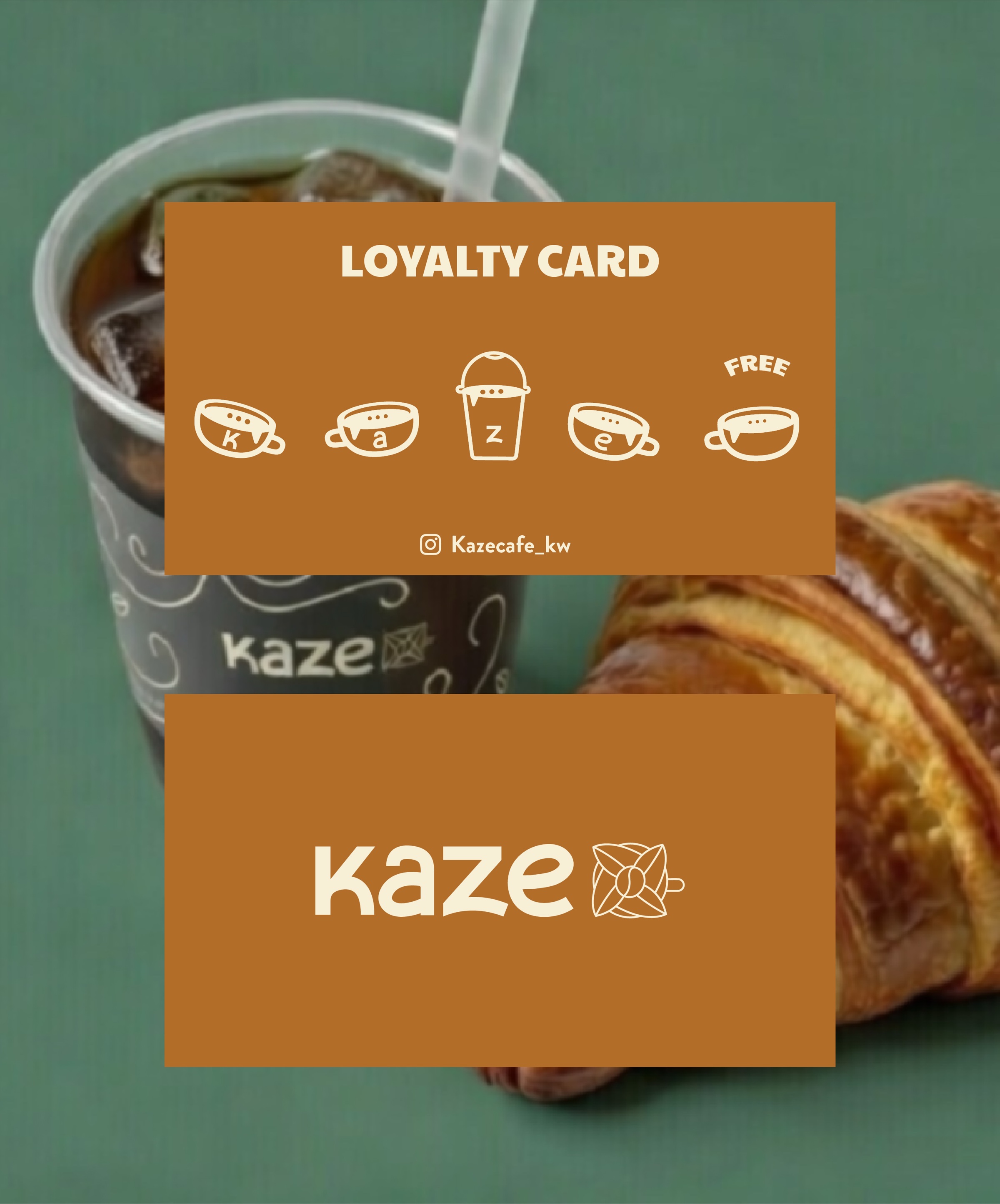
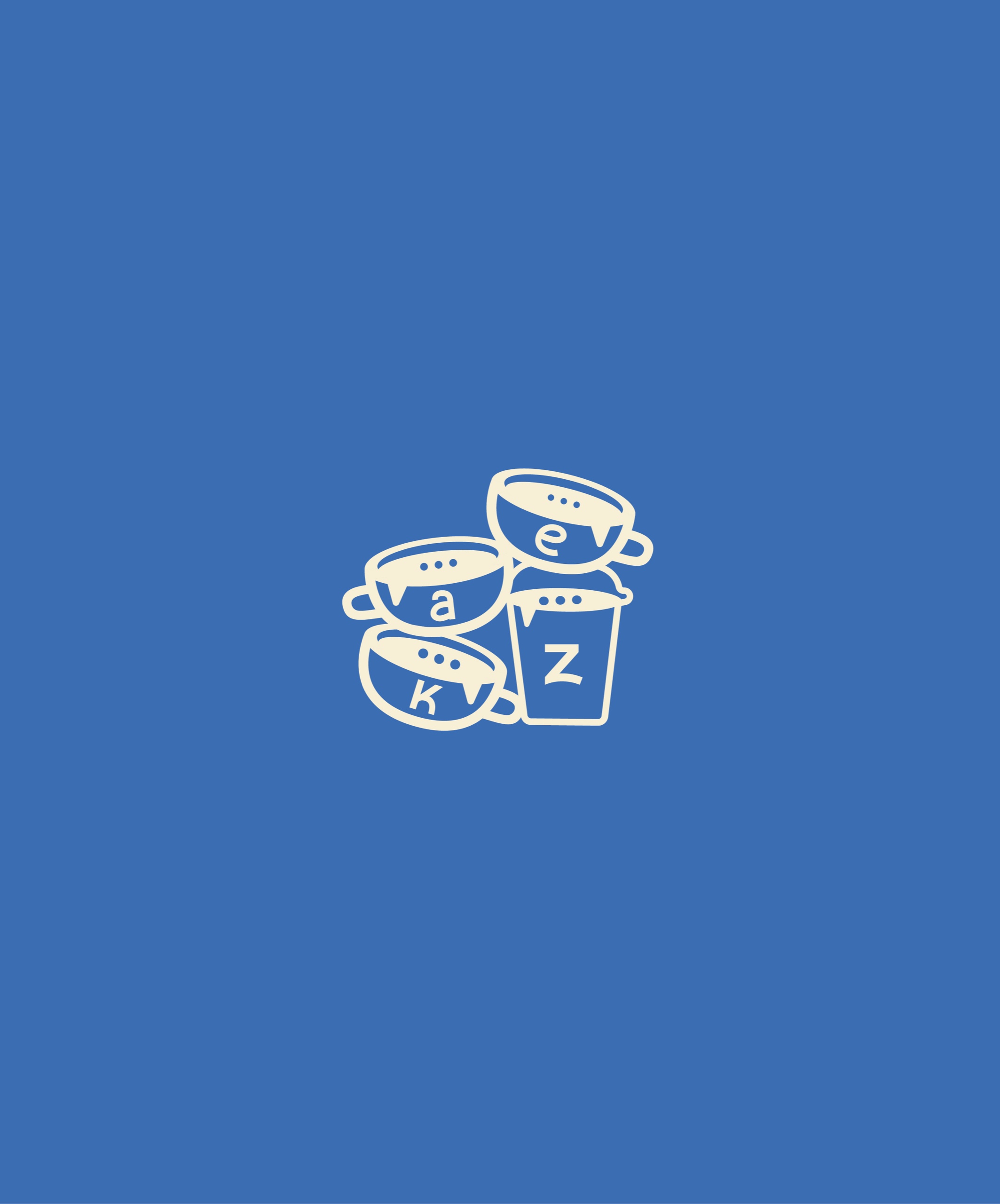
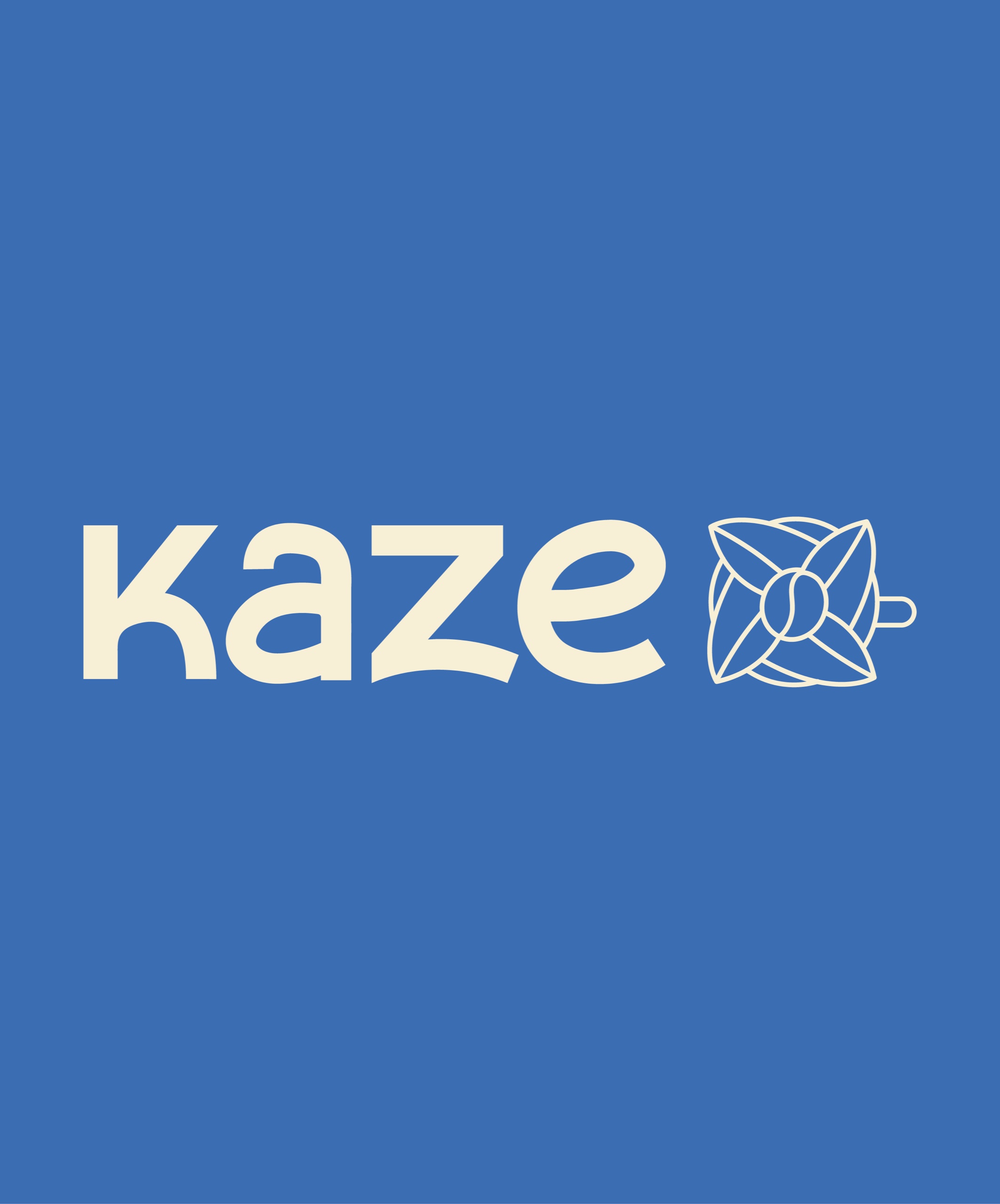
We developed the tagline and designed a range of logo variations to create a cohesive brand system. The Kaze wordmark itself is entirely custom, shaped to reflect a feeling of flow, lightness, and ease.
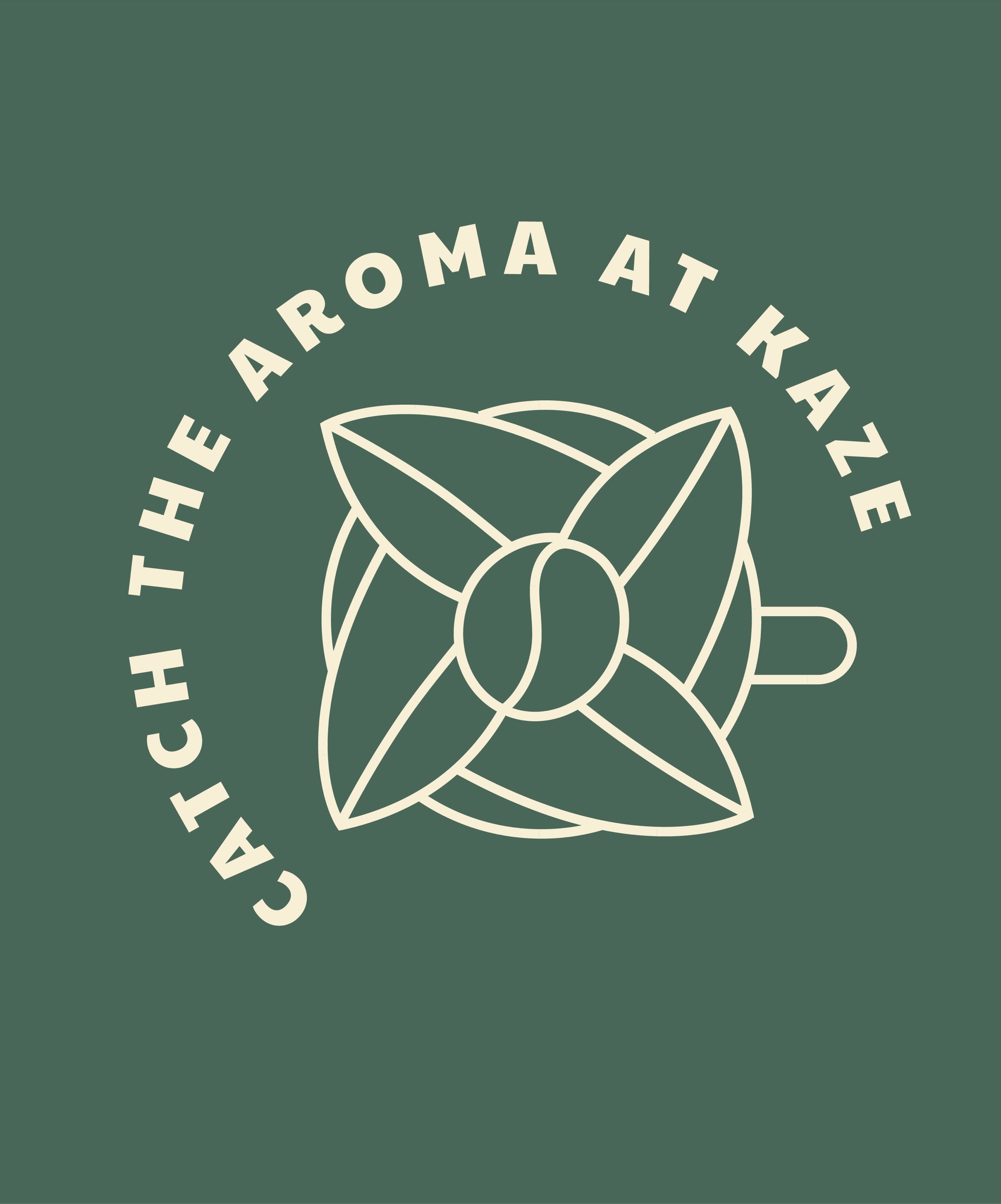
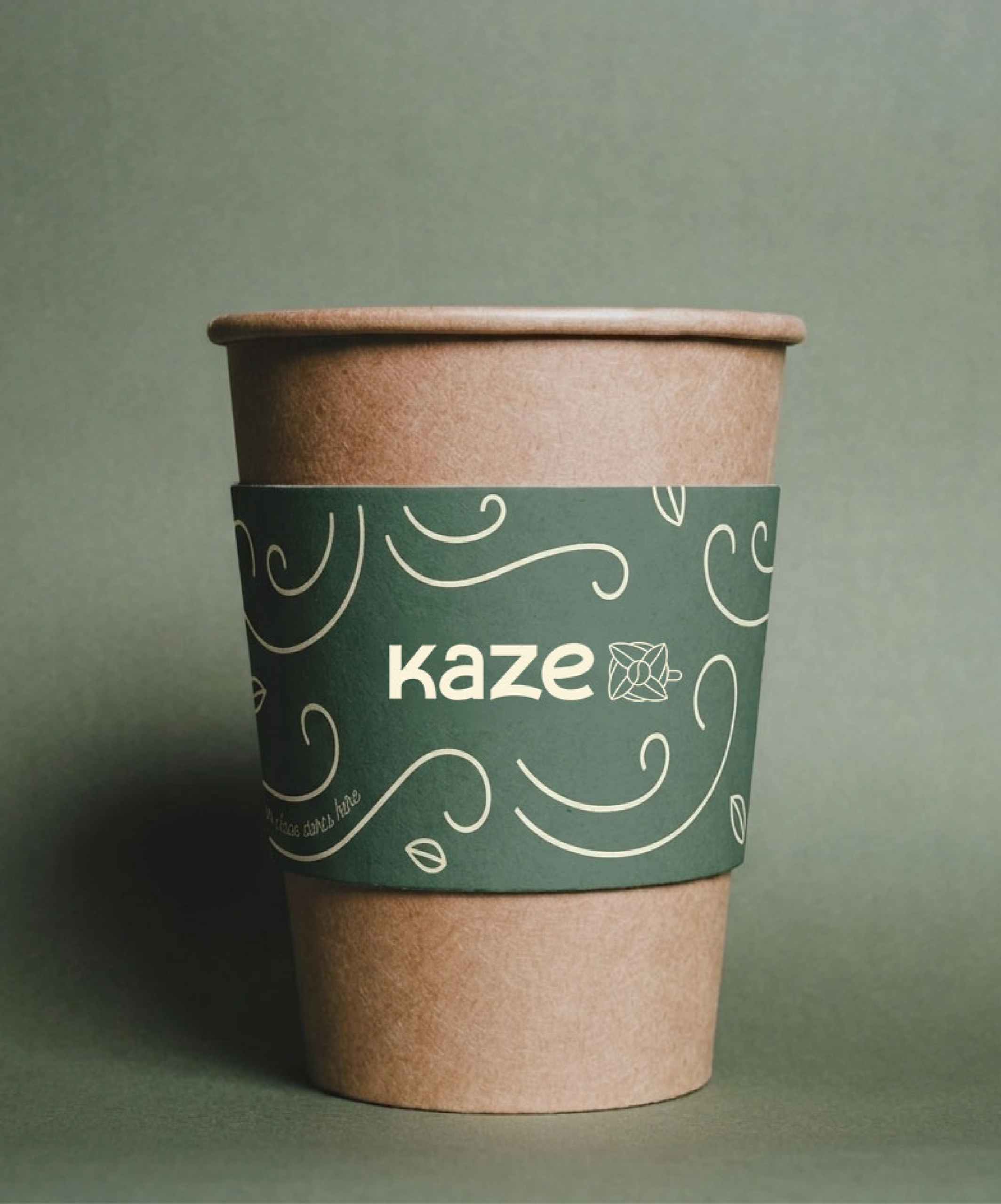
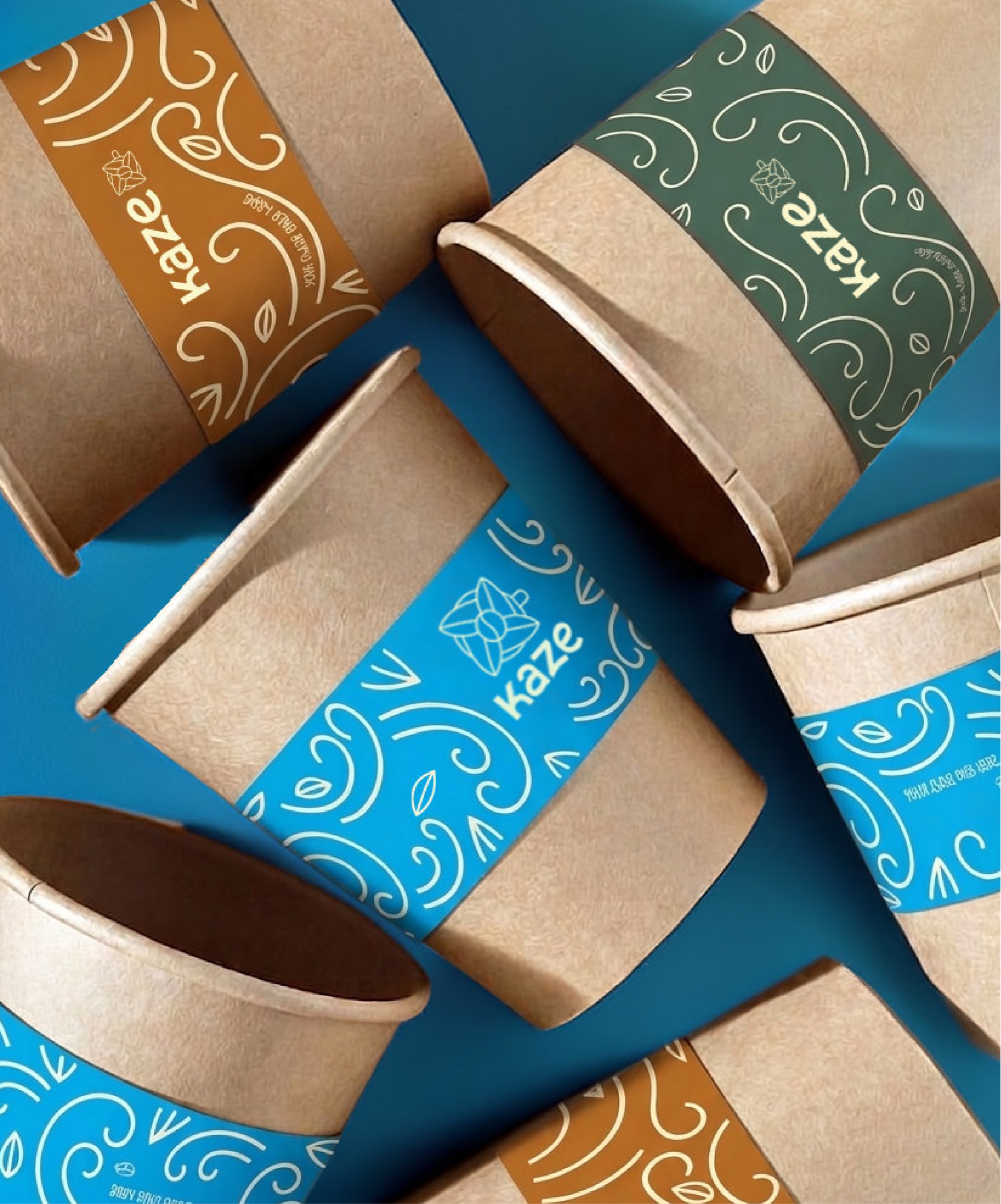
The creative thinking was carried through every touchpoint-from logo variations to the broader visual language-creating a brand world that feels fluid, cohesive, and alive.